Todor Kostov

object of interest
I want each office to have something unique, that immediately grab the viewers attention.
my goals
realistic graphics
I want my demo to have as realistic as possible graphics. It's the same as with drawing - the more realistic, the harder is gets to make. I'll achieve that via different methods, that you will find further down.
problems & techniques

This is how the level will look like - top perspective. It gives you a basic idea of how the game will feel. There will be 5 offices, where the player can walk around and explore. There will be a very long corridor, which will serve as the "scary" place - this simple corridor will build up tension throughout the game. There will be an elevator, that will only work in the full version of the game, which will come out a few months after this project has ended. The huge empty rectangle that's in the center of the map is where the conference room will be.
research
layers of fear
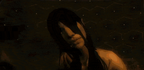
Now, there aren't many games that make me woah. This is definitely one of them. The atmosphere is absolutely spot-on, the graphics are as if an AAA company has developed the game, the story is beautiful and has to do with art... There are just way too many reasons to not just pass this game by. Just one single complaint - too many repetitive scares, but that's easily fixable. Great source of research. I've looked carefully of how the lighting works in this game, and it's how I found out not all lights should emit shadows. Also, my monster is heavily influenced by the scene you can see on the right - the distortion effect that happens when you first see the entity is worth admiring. The color pallette of Layers of Fear is also well picked - dark colors, desaturation and great lighting all contribute to how great the overall look of the game is. Definitely one of the top games I've played.

allison road
Just two words - perfect graphics. This game features perhaps the best graphics I have ever seen in a game in my life. Another thing worth mentioning - it's been done by one person in the Unreal Engine. This is where I took the idea of learning Unreal, rather than using Unity. The shadows can be improved a bit, but even with such sharp shadows, it still immerses you like no other game. The atmosphere builds up extremely well, even though there's only a prototype video of the game as of now. Colors are dark as well, with only dark and desaturated shades. Main colors - Brown, Cream, Dark Green. They compliment each other extremely well. Gave me an idea of what colors to pick for one of the offices.
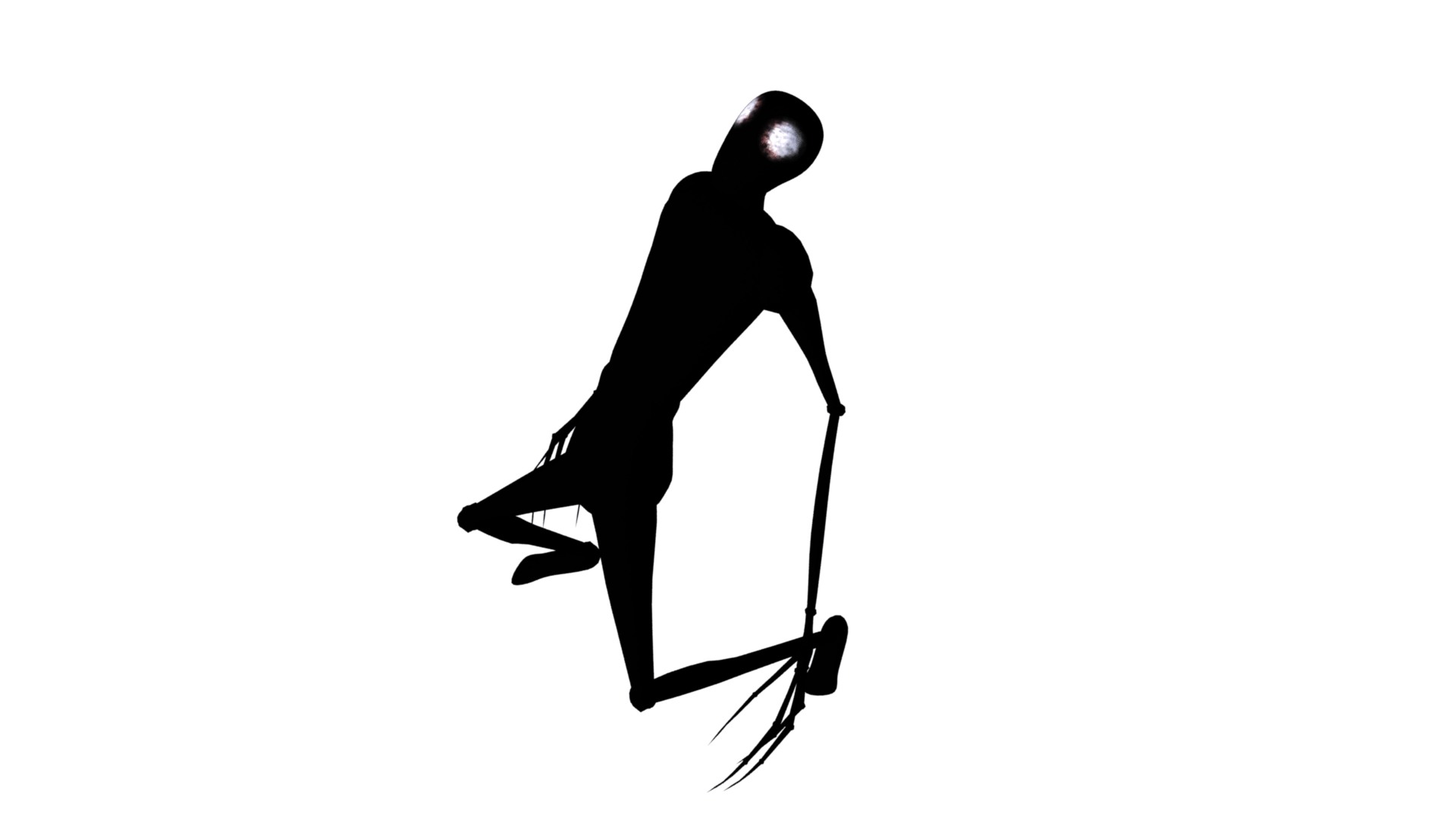
Since this is a horror game, there has to be an antagonist - I introduce you, to Malady. This is the creature that will stalk you in your adventure. Now, I know it seems rather simple and goofy for now, but with some extra work, and some nice effects, it should work just perfectly. I am going to make it's body very blurry, and it's eyes glowing in white, so ideally, you'll be able to see just two huge glowing eyes looking at you and coming closer - until it's close to you and you can see it's distorted body. I got the idea from Layers of Fear, since the wife's body is distorted there. I've also made it look very unnatural, with it's non-human movements. They are very choppy, very sudden, and generally look paranormal.
horror genre
Horror as a genre - it's one of the things worth exploring during this project. What makes a scary thing... scary? Where did it all beging? Those are some of the things worth learning. Let's start with some history, since we all love it so much.

The word 'Horror' becomes popular around 1930, but if we take a really deep look, the first fragments of what we call horror can be back found as early as 1700's. We have to go back to the beginning of Gothic literature. Many features of horror are taken from there - monsters, murderers, ghost stories taking place in ancient and dark castles, forests, etc. - this is exactly what most Gothic books are in a nutshell. Famous writers would be Mary Shelly, Bram Stoker and Edgar Allan Poe [source : http://filmmakeriq.com/lessons/a-brief-history-of-horror/]
The next step was the first horror movie - year 1896, Georges Melies creates "The Manor of the Devil". Bats, trolls, ghosts, castles and even a demon - the elements of the Gothic Horror are all very apparent in this film. It's interesting to note, that Georges plays the demon role himself.
In the early 1900's, the horror genre becomes very popular, thanks to huge titles like Frankenstein [1910, Thomas Edison's Studios, United States], and Dante's Inferno [1911, Giuseppe de Liguoro, Italy].
Now the second thing to answer - what makes things creepy. There's a very interesting video by Vsauce, which explains this very well (on the left of this text). Why is, for example, a bear with a full set of teeth considered creepy? There is a difference between 'creepy' and 'threatenng', and it lies in our brains. Things, that are considered 'threatening' are obvious threats - a gun that's pointed at you, or a hungry tiger - there is obvious reason why these things are dangerous, because we know what might happen - getting shot or getting eaten is something, to which we know the outcome of very clearly. Creepy, on the other hand, means something that is not defined - that is unknown. A bear with a full set of teeth is something we're not used to seeing. We've seen both a person with teeth and a teddy bear, but the combination of those two is just off... it's strange and eerie.
There's a thing, called the 'Uncanny Valley'. It's when there's a combination of something normal and something entirely weird - something that's looking overall natural, with just one or two things, that are really off. For example - a human with really big and black eyes, or a human with extremely large teeth and a smile. That's how pictures like the one below this text succeed in creeping us out.
Vsauce - why are things creepy

It's taken from a famous creepypasta (a short, fictional horror story). So, from all this rese-
arch, what we gather is that mystery goes a long way when you're trying to scare someone. That's the main difference between Terror and Horror. Which leads me to the next discussion - the types of 'creepiness' there are.
1] Gross Out - the gory, bloody and disgusting things. Basically, things that are morbid and that make you feel like you're going to throw up. Personally, I really dislike this type of games, and try to avoid gore and blood altogether, since it doesn't really scare you, but it rather depends on how easily the player is grossed out. Avoid at all costs.
2] Horror - in it's most basic form. Something, that is really scary is chasing you. It doesn't even have to reassemble human at all. It can be a demon - with horns, a spiky tail and bad intentions. It could be a skeleton, that has a gattling gun, a sword and a pirate hat. It doesn't have to make any sense. In the case of horror, you don't have to follow logic - it can be completely fictional. This is where the whole genre started, and it's name is the same. I'll try using some horror elements, but I want my game to make some sense, so it can immerse the player better.
3] Terror - my personal favourite. This is the Uncanny Valley we discussed a little while ago - the moment you see something very natural and normal, but something is just slightly off. It gives you massive creeps, since you have no
idea whether it's like it's normal self, or if it's threatening and dangerous. The contrast between those two, and the lack of awareness of this object/creature/whatever it may be creates this weird feeling inside the human brain - should I be afraid, or should I be calm and relaxed? This is what's terrorizing your mind. This is what I'll mostly go after, and this is why I aim for realistic graphics - so that the player can feel immersed and can forget he's in his chair at home. I'll add just some slight surreal elements to my own game, so it can make the player wonder the same thing - is this normal, or not? What are the chances of these things happening? No, something is definitely off!

Even though at this point I do not intend to put any masks in my game, it's worth discussing. Masks - why are they so creepy and eerie? If you follow the logic of the previous discussion, it should be pretty obvious - they hide identity. We do not know whether to fear the person wearing them, or not. The mask hides the face - we judge how a person is feeling by his face expression in the majority of situations. The mask hides exactly that - the person's emotions and intentions, thus we cannot know how to react. It's the Uncanny Valley all over again. Even a neutral or a happy mask can be scary, which is kind of mind-blowing - something that should bring happiness, makes us terrorized instead. This is why so many children (and even adults) are scared of clowns. The big clown phobia finally explained!
games research
It's time to take a look at what's good and what isn't in the different games, that inspired my project. I'll try to be as critical as possible.

the walking dead
Choices. Pretty much sums up the whole game. It's one of the first games, that offer that many choices. How the game plays out depends only on how you wish it plays out, which makes the game all the more personal. It's not just a game, it's an experience. I love how they left the player choose who dies, who lives and how it all happens - it makes the boring "Start game - Goal 1 - Goal 2 - Ending" game steriotype into something way more interesting. This game gave me an idea of adding "The Pill" choice at the beginning of my game. Obviously, I won't be able to expand that much on choices and different variations of my game, but it still gives the player more field on deciding what happens.

Fran bow
Originally, I had the idea of making the world have two versions. In the first one everything is normal - you go around the silent offices with no danger, etc. In the second one (that you activate with a key stroke) you would go into the bloody version of the offices, where the monster lies and haunts you. There, you would need to be extremely careful with how you move and where do you go. Why go in the second world? Because some of the puzzles would only be solvable via items that you find there. It makes the player choose where and when to press the button, and hope the monster won't pop out in front of him. I scrapped the idea, but decided to include Fran Bow in my research, since I would have never had it in the first place, if not for this game. It features exactly that kind of mechanic. Definitely worth mentioning.

stairs
Darkness - the game heavily relies on it's suspence and atmosphere for scaring the player, even without anything really happening. You know you're playing a horror game, and you expect to be scared - you just don't know when and where will it happen. The game absolutely abuses this, and lets you wander around with nothing scary really happening until it's final moments, when it all goes down. Exploring the dark bunker, accompanied by the scary noises and the lack of horror is trully an experience. It's the first time when I noticed, that the scariest thing is the lack of scary things. Weird thing, but it works like a charm.
how i got into horror games
Throughout my years of gaming, there have been a number of horror games I've played. If I have to be as accurate as I can be with the number, I'd say I've played over a hundred (without exhagurating one bit). Some of these games have been very innovative for the genre, while others have been... erm... not so good of an experience. Let's go through some of the good ones.

Fear ii - project origin
The first horror game I've ever played. I still fear this game even today. They say first time experiences last for a life time... well, it's true. The game gives you tools to defend yourself with (weapons, grenades and even a slow-motion mechanic), which work just fine against normal opponents, but they pass right through the antagonist of the game - Alma. What scarier than a creepy-looking little girl? I still try to find the answer to this day. The game offers some very interesting story, a good action-based gameplay, the slow-mo mechanic that makes you feel like rambo going through your enemies and a very dark and terrifying atmosphere. The feeling of being haunted by a little girl, throughout the entire game, gives you a good idea of how to create a legendary horror game. I've trully enjoyed playing both the first, and the second parts of the game, but the third one kind of disappointed me... Too much action, without many scares - the thing that F.E.A.R. was best known for. Basicly, I am very glad to have found this game, because it's the one that first got me into the genre, and it kept me interested and shaky throghout my horror games marathon.
F.E.A.R. 2 - Project Origin, Monolith Productions, 10th February 2009,
source : https://en.wikipedia.org/wiki/F.E.A.R._2:_Project_Origin

amnesia - the dark descent
Oh... The good old Amnesia. Now, if there is one game on this list, that made me stop playing over 10 times until I finished it, it has to be Amnesia. The game is truly unique in so many ways... Every survival horror game to this point has given you some sort of defensive technique - be it a weapon, a crucifix or even a camera. Amnesia, on the other hand, gives you absolutely no way to fight back. The only ways to survive in this game, is to either run or hide. Use darkess to your advantage, but don't overuse it - your character slowly goes insane in the dark. Go insane, and you risk fainting while being chased, which results in your inevitable death. Stay in the light, and you're easily detectable by your enemies. See a closet? Might as well hide in there, as soon as you hear the monster's growl. A fun fact is, that the game is very unforgiving - the monsters are faster than you, they're smart enough to break doors down, and they killyou in either one or two hits (depending on how healthy you are). Truly a masterpiece among the indie horror games. The amount of adrenaline you can feel, while you're running away for your life, can be compared to sky diving.

I find the graphics of Amnesia to be decent, but it's the composition of the scenes that really impress me. Long dark corridors, a lot of objects scattered around, amazing lighting and dark/desaturated colour palette - the combination of those really put the game to life. I find most of the objects to be poorly textured, with a lot of low-poly meshes, but on the other hand, this makes the game smoother in terms of requirements. Optimizing such a game requires a lot of before-hand planning, so I believe the low quality of the designing was on purpose. Also, the dark parts of the game can be a bit obnoxious - it makes some of the places in the game quite frustrating to go through. The monsters animations are really great, the soundtrack is spot-on as well, so aside of those little critiques, I have nothing bad to say about this game really. Definitely a must play, and a great source of inspiration.
Amnesia : The Dark Descent, Frictional Games, 8th September 2010,
source : https://en.wikipedia.org/wiki/Amnesia:_The_Dark_Descent
office 1


office 3


malady

first trial - rain of problems
The first time I approached this idea, everything went horribly wrong. I had no knowledge on how Unreal worked, how to do things properly and my planning was very poor. I just had the idea of making offices in mind. You can see a screenshot of how everything looked on the right. Some of the offices had carpets as a ground texture - it looked absolutely rubbish. I had only some basic idea of how everything had to look like. At this point, I had absolutely no idea what lightmaps are, and after spending about 2 months on developing this level, I found out everything had incorrect light maps. More about this a little later. I also decided to put some weird black columns around the whole level - thought it will look good, but it looked awful in the end. I spent 2 months on making this and a lot of assets for the game (perhaps around 25-30 different assets). It looked old and this was not how it was supposed to look - the story revolves around the main character owning a big and modern company, not a building from the 1920s.


Making the 'bad design' actually helped me tremendously. I learnt A LOT from that. Trial and error teaches you like nothing else. One of the new techniques that I learnt, was the simulation way to create something. The cushions of the sofa were designed this way - you create you mesh (the cushion in this example), and you play around with the gravity options - in this case, I added 'pressure' to the cushion, and it's sides exploded once the animation started. After 5-6 frames, you have a very nice cushion - toss in a 'smooth' effect, and it's ready for the audience. More in 'Techniques' down below.

A list of the assets I had designed.
I actually managed to get some nice screenshots even in the old design - creepy corridors, some good looking screenshots from weird angles (so I can hide the imperfections). You can see the images on the right side. Due to my lack of knowledge, I had some models which looked terribly - the chair is a good example. Modelling an office chair is not an easy feat, because of the amount of detail they normally have, but this one just looked awful. The plants were Maya generated, so I could not export them to Unreal. The sofa looked just bad. The mouse (hard to see) is pretty bad too. The only things that worked out well, were the monitor and the coca cola machine. The cans are over 3000 poly each, which renders them useless for my project. The design of the building itself was pretty terrible too - everything needed fixing. Even after all of that, I just didn't want to completely wipe two months worth of work, and I was willing to compromise - huge mistake. The one thing that saved me, was the lightmap error I got. I had 89% overlapping UV's. The whole level looked just black once I built the lighting. Now, I had no idea that you can choose whether to have baked lighting or dynamic - all I knew, is that I had a huge problem. What followed, was 3 weeks of reading in forums, posting topics, reading from the Unreal Documentary, trials, errors and a whole lot of headaches. I was about to give up near the end - something, that's very unlike me. The whole problem came from my UV's, as expected. Up to this point I had no idea how to UV map a thing, and Unreal has a default options of 'Baked Lighting' on. I had no second set, but it was generating one for me... according to my UV textures... which were a mess. Here's an example of how my level looked like, UV wise.


As I stated above, the next 3 weeks were spent mostly just experimenting with new techniques and trying them out. I'll describe most of the ones I've used. Here we go.
techniques
specular/normal mapping
Took me about a week to learn how to make specular maps and normal maps. The principle is quite simple and straight-forward, but getting your head around it takes some time.

My messed-up UV's. That's from trial 1.
From left to right :
Only diffuse texture - Diffuse + Normal - Diffuse + Specular - Diffuse + Specular + Normal
Like I've already mentioned, the concept is simple - specular and normal maps just add detail to your object. They don't affect the performance much, but the detail they add is what really brings your object to reality. Now, let's see how do they work, what are the differences, and why are they so good.
For the sake of simplifying it, let's use this texture as an example :
Let's start off with the specular maps. They are textures, that look really similar to the diffuse textures. The only real difference is in the colours - they are purely white and black. Now, what the specular map does is the following : it calculates which part of the surfice will reflect light and how reflective it will be. A purely white pixel will be 100% specular, while a purely black one will be 0% specular. This allows for different parts of the texture to reflect light in a different way. In my project, about 99% of the assets have specular maps - they just add SO much detail. Now, let's see how a specular map looks like.

Diffuse Map : Wood

Specular Map : Wood
This makes the object way more realistic, since in the real world every part of an object reflects light in a different way. A simple scratch on top of any surfice changes the way it's specularity works. Just to avoid confusion - this doesn't change the object's overall reflectiveness - it only changes how it reflects lights. All other reflections (glass/etc.) are handled by the roughness of the object - it's a different thing. The best way I've found to create specular maps includes photoshop. You open the original texture (diffuse texture) of the object, then you desaturate it until it's bl-
ack and white only, and then you play around with the levels of the picture. This gives you a better contrast between the white and dark areas and makes the map sharper. To top it all off, you can add some 'legacy contrast' to further boost the difference and get a nice effect. A thing to be careful about here, is which surfaces are you working with. If, by default, you have black tiles with white space between them, this method will give you non-reflective tiles with fully reflective spaces between them, so sometimes it's worth inversing the whole thing, or just painting with black on top of non-reflective areas and with white on fully reflective ones. Improvising is key in these situations. On to the normal maps.
A normal map is similar to the specular one, and it works in a similar way too. Instead of controlling the specularity of the material, it defines it's surfice. It works in the following way : A normal map uses three colours - green, blue, red. Whenever there's red, green and blue, and the pixels correspond in the same order - X, Y and Z. To simplify it further - if the colour is blue, the surface is even. If it's red or green, it means there are slopes/bumps there. Out of the two, the normal maps are way more difficult to create, so there are tons of generators online. I usually use this website : http://cpetry.github.io/NormalMap-Online/ to create my normal maps. I try to make them very subtle, so you won't be able to see much going on in the picture on the left, but it still gives good detail. If I make the bumps of higher value, it becomes very unnatural, and that's why I keep them low.

Normal Map : Wood
simulation-modelling

A smoothed 10x2x10 cube
While looking at different tutorials on how to make certain things, I came across what I call the simulation-modelling technique. The main difference between it and the normal, old fashioned way to model is that all you do here is set everything up. Afterwards, you just play a simulation (animation) and the program takes care of moving the vectors in the desired way. This is perfect, since it's quicker, it's a bit more randomised, and whenever you have something like a cushion, it takes gravity into consideration too. Overall, a great method, but obviously it doesn't work for everything.

The same cube, 38 frames in the simulation
Pressure set to 1

Another thing I've done using this method are balls of paper (crumpled). Since modelling that would be a nightmare, I did a plane modelling, textured it and ran a simulator. This time, I used it's weight + a little course on the bottom. When it falls down it gets deformed according to how the course looks - just some random playground with boxes and pyramids works perfectly. At the end, you've got a decent looking crumpled piece of paper. I love it!
UV-texturing
Recorded Cushion Simulation

This was, hands down, my biggest demise. I used to fear UV texturing. It was just an entirely unknown area for me, and I had no idea even where to begin. After I saw the 'Overlapping UVs' error, my first thought was that it's my UV-texturing that was terrible, and thank god I thought that way - I finally sat down and learnt how to properly do it. Took me about 2-3 weeks to just get the concept of it, and another month to get somehow decent at it. Let's discuss!
UV-texturing is effectively making a 3D object lay down on a 2D plane. If that's difficult to understand, it's basically the object's faces. I used to think, that every object in 3D is actually solid, until I decided to learn UV-ing. Every object is actually hollow - imagine a box. Everyone has eaten a pizza. If you unfold the box, it become way bigger - that's what the point of UV texturing is - unfolding.
Theoretically, it sounds extremely difficult, and to be honest, that's not far from the truth. The good news is, that Maya automatically makes most of the job for you. It gives you the 2D parts of an object, in the correct scale when you use 'Automatic Mapping'. From there on, it's just a matter of connecting the right edges, and that's only if you want to have less seams on your objects. If the seams do not matter, you can simply Automatic Map and leave it as it is - it's done. Automatic Map generates between 3 and 10 planes, that all project in-front of them and for each face, whichever plane covers the most space, it's projected by that plane. Think of it as a lot of Projection Map planes, that automatically decide which face is projected how. It's extremely useful. That, however, is just the beginning of the UV texturing.

The completed UV of the back of a sofa for the game
Same UV, but after Automatic Map
Things to look out for include whether the UV shells are facing the correct way, whether everything is scaled correctly, whether the seams will be visible, whether those seams actually matter, etc. The UV's should also stay in the 1:1 UV space - it's a small box, where the picture (texture) is situated. Having a simple object like this one makes UV-ing it quite easy, but it's not always such a child's play to make proper UV's.

One of the chairs, seen in-game, and it's UV
The example on the left is a bit more difficult. I wanted the object to have as less seams as possible, so I decided to have where the edges are being cut in mind this time. Also, I love how the object was laid out in the end, and how good it looks in game. After placing the UV's, a good method to increase the resolution of the texture (only applicable if the texture is seamless) is to increase the number of times, it repeats itself on the X and the Y axis. This makes the resolution better, since it makes the texture bigger. The good news is, that this is automatically translated over to Unreal when you include the materials with the export.


The way I use specular/normal maps greatly differs between what I'm using them for. If it's for an object (asset), I would normally just make a duplicate of the original texture and stick them on top, but that's not always the case. In the scenario on the right, I use normal/specular maps in a completely
different way. In that example, I use a diffuse map of floral effect with an yellow background, but my normal and specular maps are just noise. In other words - I use normal/specular maps for what the object feels like, and diffuse for what it looks like. That's the basic guideline for the way I model. I know that walls are bumpy, so I used a texture of flowers, with bumpy normal/specular maps. Normal and specular go together, since depending on how bumpy the object is, it's reflecting light in that way.
Wall in Office 1
Wall in Office 1 - Close Up


Normal and Specular map of the same wall
The canvases are done in a similar matter - a diffuse image, with normal and specular maps of how the canvas material is. I think this gives another layer of realism to any object, and it just looks good.
Canvas in Office 1
Glass Desk - Office 3 - Right Column's Texture
Right Column's UV
The desk on the right, has one of the meshes I'm mostly proud of. What I did there, was - create the mesh, fix the UV textures, take a snapshot,
take the snapshot to Photoshop, put textures and thread seams on, and take it back to Maya. I loved the process, but there's a huge downside to it - it's very lenghty. It took me well over an hour to create it all, and that's a long time for a simple part of a single asset. The whole desk in total took me about 2 and a half hours, since I used the same method for the rest of the parts of that desk. The end result is well beyond the expectations I had when I first started making the desk, but it took a long time. And I forgot to mention, that this desk was just a simple test, that I started in Maya - I wasn't even planning on making it into an actual asset for the game, but it just turned out to look very good.
lightmapping
This bit was the most difficult to get my head around. The 'Overlapping UVs' problem I had in Trial 1 was due to incorrect light maps, rather than the UV textures themselves, but I got to know that only after I fixed the UV's of my assets, and the problem still persisted. By default, Unreal Engine 4 uses lightmaps. Now, let me explain what a lightmap is first.
When the game starts, your computer loads all the textures, light sources, assets, triggers, etc. This stuff is all loaded, and it happens only once - these things are all baked into the game. The computer does not calculate any of that - it's all already there. The second part of the game is the calculations - they happen dynamically in real time, as the game plays out. Example - the light source has bouncing light enabled, so the computer calculates where that light will go, after it has bounced. The latter is more performance-costy, but achieves better quality. Now, the biggest question of game designing - how do I optimize my game?

The concept of light mapping is quite simple. It makes, what normally would be dynamic lighting (in-game realtime), and makes textures using it. Imagine it as a layer in photoshop - you have your diffuse layer, on top of it you have the normal and specular layers, and on top of them you have the lightmap layer. The lightmap baked the lighting in a layer, that then goes on top of the texture. To simplify it, imagine a camera. It takes a picture of how the lighting currently is, stores it, and then you can remove the lighting but the shadows will stay the same. Even better - Unreal turns the lights off for you. For example, in one of my scenes, I have a 'Stationary' light. What it does, is it calculates how the shadows will look in real time (to make them look better), but it bakes all the indirect lighting (bounces). This makes the game's performance at least five times better, while also saving the direct shadows quality. Indirect lighting is meant to be something very subtle, so it won't be so noticable that the quality of it dropped. Direct shadows, however, should remain top quality, since they are very visible. Now, let's see the different lightmap resolutions we can use. At a resolution of 64x64, everything is very blurry and has artifacts. An artifact is a piece of light, that shouldn't be there. Now, in this scenario, that's not visible, since light bounces once on the surface and goes off to the sky again, but in a closed area it will be way easier to notice. I really cannot think of anything that should have such a low lightmap resolution. Next, we have 128x128 - a resolution, that could potentially be used, if the shadows that fall on those things are extremely small. We're talking about very small objects - pens/balls of paper/etc. Next on the list - 256x256. This could be used for a bit big-
The baked-in shadows in the lightmap volume

Lightmap Resolution - 64x64

Lightmap Resolution - 128x128


Lightmap Resolution - 256x256
Lightmap Resolution - 512x512


Lightmap Resolution - 1024x1024
Lightmap Resolution - 2048x2048
ger objects - pieces of paper/phones/etc. At 512x512 the shadows actually start looking realistic even with bigger objects - monitors/keyboards/smaller tables and desks/etc. Now we're getting to the good ones - 1024x1024 is what I used for my walls/floor most of the time. Also, if the object will be an object of interest (like a canvas you can see in Office 2 - down below in the in-game images section) you can use that kind of resolution. This is the resolution I mostly use for most of my things, because, as I stated already, my direct shadows are being calculated in real-time, so I don't bake them at all. The resolution we're talking about is only for the indirect lighting, which looks good enough with this kind of resolution. Overall, this does most of the job. Now, if the 1024x1024 texture is insufficient, we can go to the next level - 2048x2048. I try to avoid using this, since a texture of this size is 4 times bigger than a 1024x1024 texture, and in translation, 4 times more performance costy and spec demanding.

Dynamic Shadows - For comparison purposes
Alright, so lightmapping is awesome, but how do we create light maps for different objects? Well, the process is lenghty, but I'll try to make it as short as possible. There are a couple of things to watch out
for, and one of them is setting up the UV grid. Since we have to create the lightmap UV with an exact resolution, it's important to plan ahead - what lightmap resolution will it use? It has to be to the power of 2 as well. So, 128x128, or perhaps it will need a higher one? A good rule of thumb here, is to see how big the object is. If it's a small object, it doesn't need a high resolution, since the shadow pixels density will be higher than that of a bigger object. If it's a wall, for example, I know I'll need a high resolution for it, so I go straight for 1024x1024 (or 2048x2048 in extreme cases). Now, to set up the grid in Maya, we need to do a very simple calculation first. We need to divide 1 by the resolution we're aiming for. The reason for that, is that Maya sets up the grid spaces in the UV editor in ratio to it's 1:1 space, so we have to say how tense the grid will be, compared to the 1:1 UV space. That will give us an accurate result - 1 grid space in Maya represents 1 pixel space for the lightmap texture in Unreal, so each Maya grid space will be filled by a pixel of shadow in Unreal. Here's an example.

Here, we want our cube to have a lightmap resolution of 512x512. We grab the handy calculator, and we do a 1:512, and we get this result. Afterwards, we open the Grid Options and we put it in the 'Grid lines every:' box, so we get a real simulation of how the lightmap resolution will be, inside of Maya. This is important, because of the next step - each shell has to have it's OWN space in the grid, and it must be attached to it. This maximizes efficiency and gives better results with lower lightmap resolutions. Let's see another example of how to efficiently do that. The picture on the lower-right gives you a basic example of how to do one of the faces of the cube. The edges of the shell are on top of the UV grids, so that it covers the maximum of it's space. One more very important thing to notice is the space you leave between the different shells - there must be at least 2-4 grid spaces between all the faces to avoid light leaks/weird artifacts/etc. An important thing to aim for here, is to take as much of your grid space as possible - this makes lower resolutions look better once again. One of the tricks I learnt as I was getting more and more comfortable making light maps, is the 'importance' trick. That's what I call it at least. Basically, this involves planning ahead again - which parts of the mesh will be visible. The ones you cannot see do not actually need much grid space, since the shadows on top of them won't be visible as well. That means, you can grab them and simply scale them down until they are barely seen, and put them in one of the corners of the UV space. This allows the rest of your faces to receive more pixels, making them better. With this trick, you can easily make your 1024x1024 light map look as good as a 2048x2048 that doesn't use this trick.
It's important to note, that Unreal uses one channel for the diffuse texture and another one for the lightmap texture. It's important to create a second channel for the lightmap, since lightmaps and defuse maps greatly differ in most of the cases.
Now, there is a lot more to light mapping, and even I don't know all about it, but we should keep moving on. On to what I've actually created now!


UV texture of a chair
Poorly made lightmap of the same chair
One of the main differences, is that UV textures can overlap for the sake of saving space. Lightmap textures cannot overlap, since that gives you a ton of errors and your get very messed up shadows in the end. Secondly, diffuse textures should have as less possible shells as possible, while lightmaps should have a different shell for hard edges. If you have a cube for example, you wouldn't attach the faces together, but you'd keep them seperate. Enough for lightmaps, moving on!
welcome to the offices
Before I started the offices, I had a few things in mind. Each office should have an object, that just stands out. This sets the overall atmosphere in the room to modern style, since every modern building has one of those things. Be it a weird flower, a vase, or even an image on the wall - I want each office to have it's own thing. The next thing to keep in mind is the colours. The corridors colours will be in dark cream, so dark yellow-ish will be my main colour of choice. Now, I want all of my colours to work well with dark cream, but I also want to try different design for the different offices. We'll see how it goes!
The first office I modelled and textured. The image has the 'bloom' effect a bit too high, so it normally isn't that shiny. The object of interest is the huge picture of a woman on the right side of it. Since it's a female office, I decided to add a tint of purple (the neon lights near the picture). Since it was the first office I modelled, I tried to not improvise too much with it, and add just standart things. I am overall happy with how it turned out, but it doesn't really have much to offer - not much is going on here. It's also the smallest office. The light rail on the ceiling is something interesting I suppose - I wanted to make a rail of projectors, since that looks very modern. Also, you can see most of the walls being in cream colour, so we're sticking to the main colour palette. The wooden floor is something I decided to go with, after trying the carpet on the first trial - it just looks so much better. Also, it's not very visible on the picture, but the wall that's invisible here is actually a huge window - glass screams modern. That's pretty much it for this one. Pretty standard.
office 2
My precious... Really, this is the office I'm mostly proud of. I added some assets and it just came to life. The picture on the left is probably my best screenshot so far. The only problem is, you cannot see the object of interest in it. It's the canvas, that's on the left of the camera (see image below). I tried to make most of this office made out of wood. Some of the assets in there are created from real life pictures, so that it looks even better. The thing is, that was the office I had most problems with. Since it's a huge room, and I had almost no knowledge in lightmapping, this was a huge obstacle for me. There's an image that perfectly describes what the problem was and how it looked like (the one below). Due to the light bounces, and the terrible job I did with
Bouncing light creates artifacts, top right, ceiling
setting up proper light maps, the ceiling had some huge artifacts. Also, I used 512x512 resolution for this, which already kind of set me on the wrong track. That's when I created a rule of thumb - never used anything lower than 1024x1024 if
you're making walls/floor/ceiling. Basically, every room part should be with 1024 resolution or bigger. I managed to fix the artifacts, but that took me 2 weeks of just playing around and reading in a ton of forums about lighting in Unreal and how exactly does it work. Aside of that, I'm very happy with how this office turned out! I think the lighting is great, the architecture is modern and the colour palette is dark cream again. Perfect!

This is the most recent office I've made, and isn't fully developed yet, but it will be soon. There are many things I'm proud of in this particular one - the chair for example was pretty difficult to make, but it looks amazing. The canvases are again the point of interest in the office. I'm really proud of the plant - I made it, by using planes. You can see a break-down of it just below. The two white dots on the table are balls of paper. They won't actually stay there,

Plant in-game
Plant in Maya
I just wanted to test how they'll look like in-game. This room overall has a white-red-black color palette, but I wanted to have at least one room like
that. It has three windows, two of them going together (the ones in the picture below). The big one is pointing at the corridor, that isn't modelled at that point. Also, I decided to improvise with the lights - it was just a design I had in my head. Never seen anything like it, but hey, it looks good. I like the contrast between the red chair and the rest of the room, which is in white/black. It's a famous style actually. Had minor problems with lightmaps here again, but managed to fix them too, after learning even more about light
maps. You can see a huge motivational quote on one of the walls, I just thought it'd look great. The huge lamp in the centre of the room is also something I'm proud of. Instead of adding a point light there, I decided to add two spotlights - one pointing up, and one pointing down (only the one facing down creates shadows, because... performance).
conference room
The conference room was something I just wanted to create, without knowing what am I getting myself into. Three glass walls, and one solid. Neon lights all around the ceiling, with a huge point light in the center (haven't modelled the lamp at this point). Many chairs, a huge table and a big TV on the wall. I'd say the point of interest here is the TV. It's horror themed after all, a not-working TV is great! The lights on the right side haven't been built yet, that's why they look so weird. Need to tweak some things around this room, but it's one of the latest ones I've made, so it's still under construction. On to the next one!

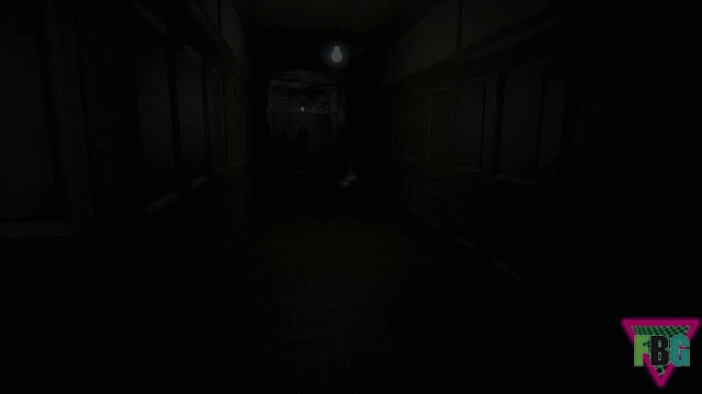
the corridor
The most recent room I've done. It's supposed to symbolize the characters sick mind, so it will be pretty dark and chaotic in there. It's difficult to see what's going on in the picture, but it's still under heavy construction. There will be a lot of post-process effects going on here, so that you can experience the horror to it's fullest. There will be some writing on the walls with blood (you can actually see it on the left wall), very little lighting, possibly one flickering light... scary stuff in general. I've also increased tremendously the contrast in the textures - the colours are unnaturally contrasting.

Malady V1
The first version really don't have much to offer - a simple mesh with a weird animation. I like the movements of it, but the general look is simply bad. I am not focusing that much on the monster really, since getting the level is a bit more important to me. I want the monster to have distortion on it, for which I'll have to do more research, but I'll get it right. On to the second version!
Malady V2
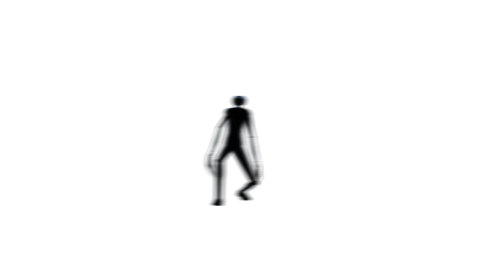
Here, Malady is blurry, has distortion and everything, but there's just a slight problem... this is a file, made in photoshop. It just shows what am I aiming at, and making this sort of texture effect in Unreal is a whole different topic. Randomizing the distortion pauses, randomizing the distortion values, getting the distortion itself to work, adding blur to the texture - all of these are things I do not understand at the moment, but eventually I'll get them all down, and this will be the general look the my monster. It's simple, but mysterious, and that's exactly what I'm aiming at.
collaboration
Since this is a huge project, and will eventually turn into an actual game, I needed some help. Design-wise, I could do all the job myself, but I needed someone to help me with music/programming/voice acting/etc. That is why I decided to reach out to people, and got some help from different sides of earth!
music
architectural visualization
I am very happy with how the project turned out. I have to admit, some things could definitely use some improvement (the monster at the end of the video looks terrible, some of the light maps are bad, corridors are missing, etc), but I'm still very happy with myself. I aimed at realism, and I think I managed to get it for the majority of the set-up. If I had more time, I'd definitely try finishing the complex, but this will have to happen after the project's deadline. I am still finishing this project and will try making this game somehow popular among the indie titles. This project taught me many things - how lightmaps work, how to texture, how to make things realistic, how to compose scenes in Unreal, how to model properly - everything I know pretty much.


statement of intent
great lighting
The object of interest will mostly be highlighed by lights. This will make the player focus on the said object immediately. Also, making lighting work in Unreal is pretty difficult, so I'll have to focus on this a lot.
immersive atmosphere
I want the viewer to feel as if it's him walking around the offices while watching the video. I want the player to feel immersed, through the music and the visuals.